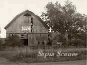
Using Photoshop Elements, I duplicated the photo to create two layers. Then I converted the second layer into sepia using the old paper filter (yep, again. I like that filter!), and then, using the eraser, I removed the old paper over the red ball. Finally, I merged the two layers and voila! Hope you like it!
 To view other Sepia Scenes visit MaryT, theTeach at http://sepiascenes.blogspot.com

I like it! I like your method too. I'd have tried to mask it out which would take far longer and probably end up looking sloppier. I'll have to try it your way next time :).
ReplyDeleteI do like it and I'm going to try that method.
ReplyDeleteIt looks really good! I love the scene.
ReplyDeleteI LOVE it!! I have PSE5, not 6 - so I don't have that Old Paper filter. Boo Hoo!
ReplyDeleteI like what you've done. Very creative!
ReplyDeleteB.
I like it , I like it!!!
ReplyDeletewell, the old paper filter trick is like looking at the skin on the backs of my hands so not that so much. :D
Just a touch of red. Really like this photograph.
ReplyDeleteLeedra’s Photos For Fun
Photography By Leedra
I love it. Great photo and improvements.
ReplyDeleteReally nice photo. I like the old paper touch. Of course I have no idea what you are talking about. I have so much to learn.
ReplyDeleteNow this is a very interesting job done here with the photo.
ReplyDeleteI must say I guess the original scene would certainly be worth seeing, but this sepia touch makes it all much more interesting!
I like the effect. I saw three guys on Photoshop the other day and they were talking about stuff I never knew about. It will take me years to catch up with my son who is something of an expert.
ReplyDeleteMarvellous post with beautiful strange subject! It is beautiful and I like!
ReplyDeleteIt totally works.
ReplyDeleteI love it! I have got to take the time and try some of this stuff again. I love that you left the touch of red!
ReplyDeleteThat is just totally beautiful.
ReplyDeleteIt's beautiful, your spot of red. Such a nice choice of scenery for adding just a bit of color.
ReplyDeleteExcellent!
ReplyDeleteThat touch of red was a brilliant idea.
Wonderful. Excellent. Fabulous! Well-done.
ReplyDeleteLooks very good! The composition of the picture is great and very good what you've done with it.
ReplyDeleteI love this shot! I need to take some photo editing classes! I just got Photoshop Elements for myself for Christmas. I've barely learned anything about it.
ReplyDeleteI love it!
ReplyDeleteThe way that spot of red pops out is great. Good editing job.
ReplyDeleteDarla
Your work on this shot was well-worth the effort!
ReplyDeleteI love how you say "voila" !!
ReplyDeleteI'd still be trying to find my first layer lol
this is a perfectly composed scene
What a beautiful scene! Would make a beautiful postcard. . .
ReplyDeleteWow, that's an interesting image. I had no idea you could erase layers like that to show color beneath. I'm going to have to give it a try.
ReplyDeleteI absolutely LOVE this shot!
ReplyDelete:-) I'm still trying to figure out how to add a touch of color to a black and white shot.
I like this effect, I will have to try it myself.
ReplyDeleteThat looks really artistic! Love the splash of red :O)
ReplyDelete