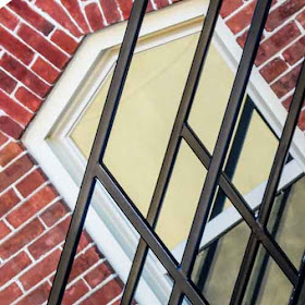
The original photo
"Every child is an artist. The problem is how to remain an artist once he grows up."
~ Pablo Picasso
B&W version
Cropped and turned
cropped
Cropped, split toning, poster edges
I am joining Geometric Friday HERE.
I am linking to NF Digital Art Meme HERE.
FYI City Daily Photo bloggers: The February 1st theme - If you had to leave forever the city from where you usually post, what would you miss most?


Creative work with the image. I like that cropped and turned version the most.
ReplyDeletei think i like the cropped best!
ReplyDeleteI like them all! This is a great exercise!
ReplyDeleteWhat a great exercise indeed!! I really like them all, too, but then I always like all of your photos!!!
ReplyDeleteHope you have a great weekend!!
I can't decide because they are all wonderful!
ReplyDeleteOkay, I have to be different. I like the black and white.
ReplyDeleteI like the b/w.
ReplyDeleteAdd another for the b&w.
ReplyDeleteIn re the first photo - this is one shot that I think works best in b&w...very artsy and dramatic ... everything is going every which way, including the brick. Dynamic!
ReplyDeleteI like the first shot and the color of the brick.
ReplyDeleteI love the graphic lines in these photos. Nicely done.
ReplyDeleteI like all the photos. I am intrigued by the geometries.
ReplyDeleteWell done, Tina.
Have a Beautiful Day!
Peace :)
Creative post editing process, all wonderful images!
ReplyDeleteI like them all- I go for color and crop first b & w last!
ReplyDeleteYou found a scene with lots of angles and interest and went wild with it. I'm going to have to check out that Geometry meme. Interesting.
ReplyDeleteI love what you did with the last one the best! They seem to be not making fire escapes any longer, you see less and less. I wonder why that is? I guess all newer buildings are obliged to have more than one entrance due to fire code.
ReplyDeleteI like the black and white because it reminds me of the fire escapes of my childhood in Montreal. It's fun to play with our images, eh?
ReplyDeleteThe cropped and turned version creates an illusion of slow movement. Fascinating.
ReplyDeleteExcellent results, very creative !
ReplyDeleteGreat photo art.
ReplyDeleteA very interesting subject. Lots of lines, patterns, angles etc. Personally I prefer No. 1 and 2 (the others are too cropped for me). I like monochrome very much, but here I feel that the colour version gives me more.
ReplyDeletefunny and creative ! I like how it turns in the last picture !
ReplyDeletePablo would be impressed,because I do think the cropped one is like a painting.Super image, and I like the black and white one too.
ReplyDeleteI like them all! Phyllis
ReplyDeleteI like them ALL but i think the black and white i like a tad more than the others. this is true art to me...
ReplyDeleteLooks like you are having some fun! I have to say, I like every one of them. Those windows are nice. I like all the lines.
ReplyDeleteI love the brick treatment above that window!
ReplyDeleteBrilliantly graphic shots!
ReplyDeleteI love that Lori started this meme. Would any of us have even seen this as a geometric masterpiece before we were tuned in to it by her? This is just awesome and surprising at the same time. Everywhere we look we see those tell tale shapes :) Beautifully done ...
ReplyDeleteAndrea @ From The Sol
Hmmmm. I'm going with the original.
ReplyDeleteI love these creative images. Well done!
ReplyDeleteIt is a beautiful BW Image and I like the glowing one at the end. Just hoping it is not fire :)
ReplyDeleteSometimes, b&w is the best way to go, as in this case, for me anyway.
ReplyDeletelove the split-toning/posterized image especially
ReplyDeleteWonderful image for the theme. Architecture usually makes such lovely geometric images. And I love stairs of all kinds, too.
ReplyDeleteReally liked your cropped and turned shot...sometimes I forget a new perspective can result in a dynamic shot♪
ReplyDeleteOoh, nice edits!
ReplyDelete